STANFORD
DESIGN
IMPACT
Brand Design
The goal of the project is to design a visual language that will serve as the foundation for branding and other future visual material. Coming up with a clean and clear visual hierarchy was key, not only for the audience looking at the materials but also for the people that will be creating materials in the future such as professor’s lecture slides, posters / flyers for future events, websites and so forth. The style should be clear enough where anyone with or without any visual design background can understand and manipulate to create new visual material. This led to the creation of the Design Impact Style Guide.
The cover of the style guide.
The logo consists of a simple logotype distinct enough to be recognizable but not so much that it becomes the dominant mark when used in layouts. The program is set to change the theme every three years so this gives the flexibility evolve the logo in the future.
Logo sketches.
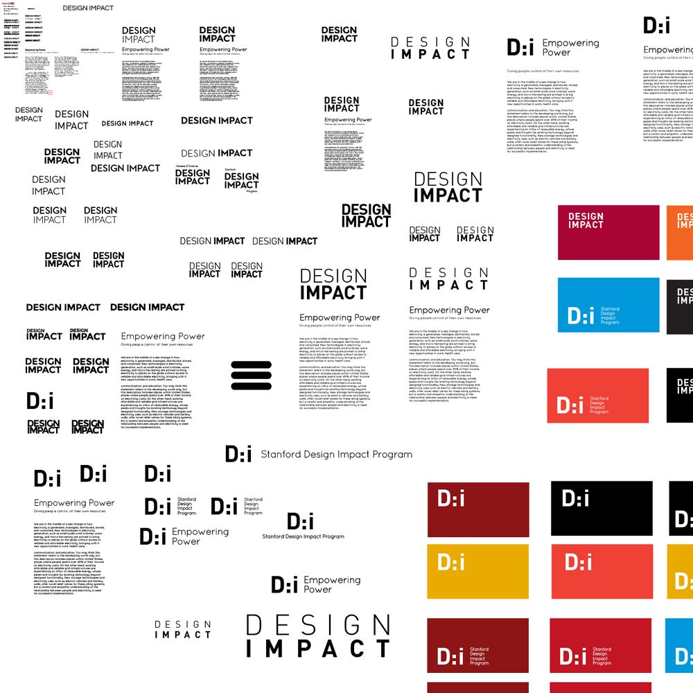
The chosen logo.
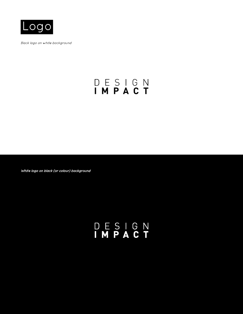
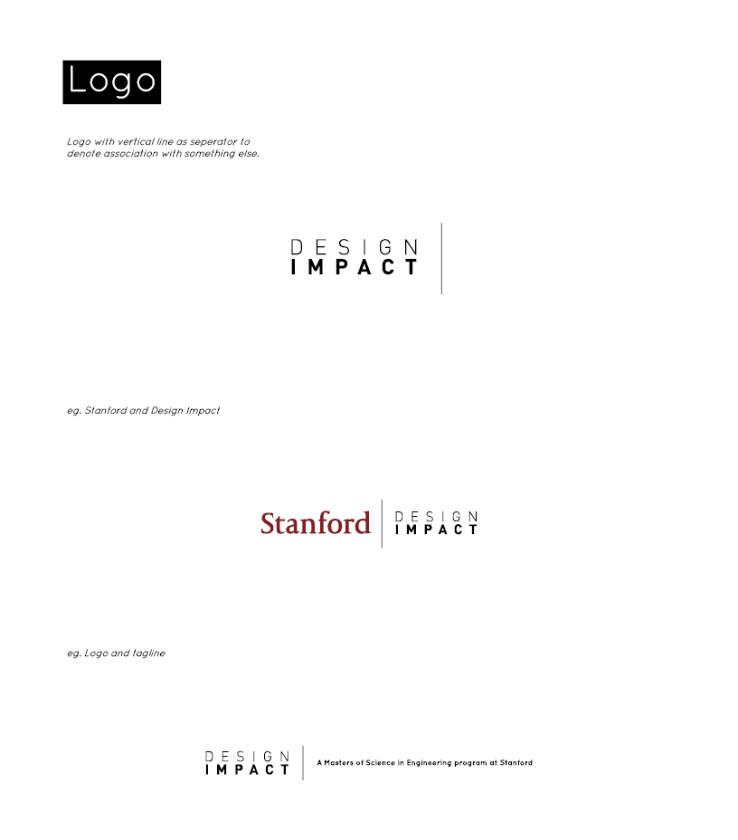
The style guide shows different ways on how to use the logo.
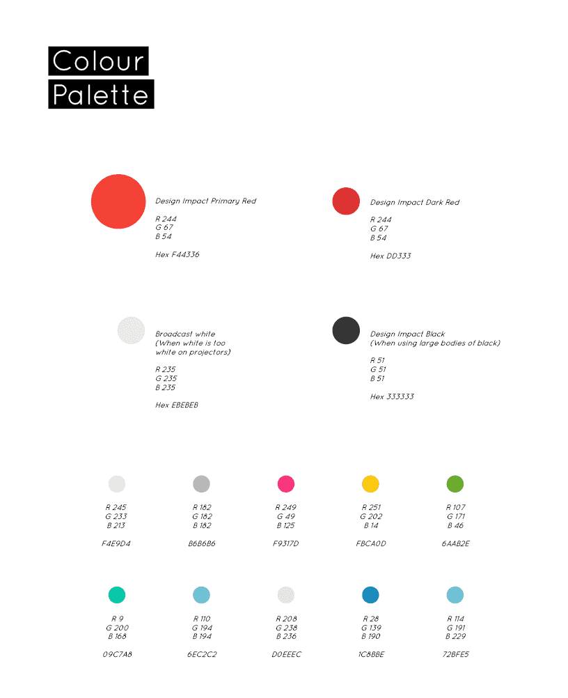
A colour palette was chosen that will stand out and also have some relationship with Stanford’s cardinal red.
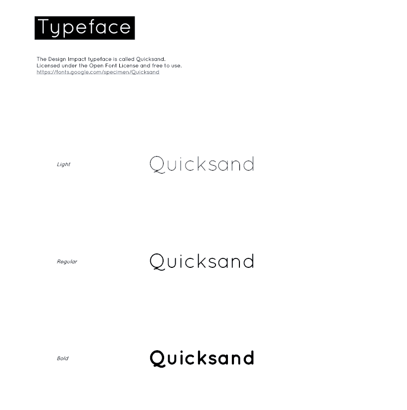
A single typeface was chosen to be used in everything.
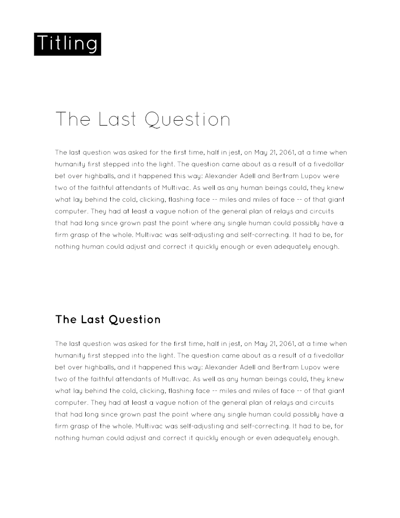
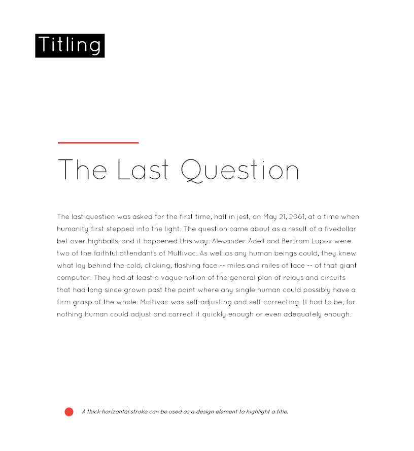
The style guide include examples on how type and title should be laid out and how design elements can be used to help with visual hierarchies.
Taking inspiration from The New Yorker magazine's usage of clean layouts complimented with beautiful drawings; Kanhika Nikam was brought on to the project to create illustrations that can be used to in any branding material. The style of the illustrations should elicit a unique playfulness that is reflective of the program.
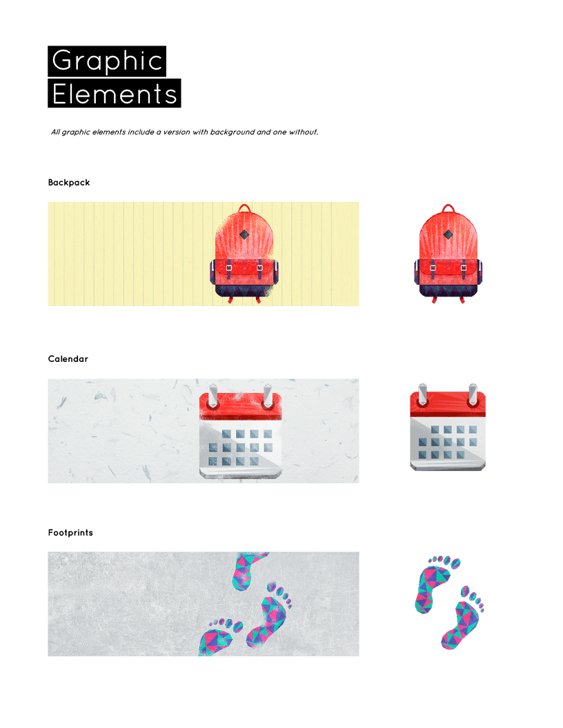
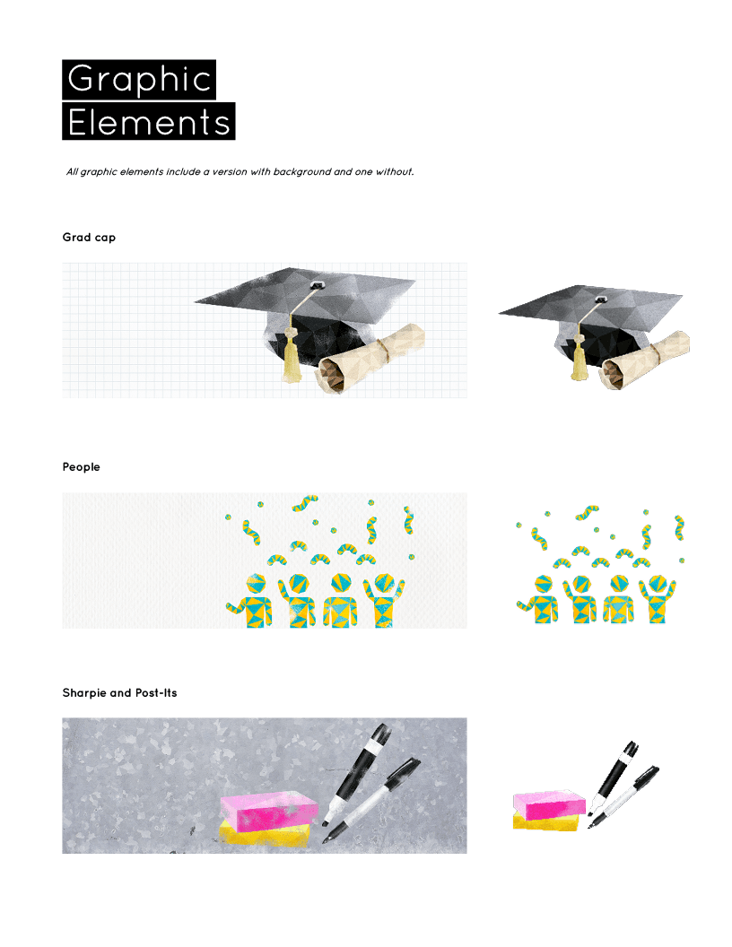
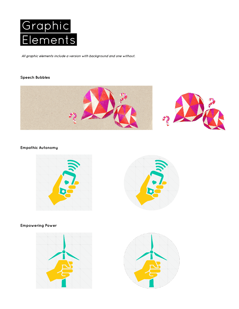
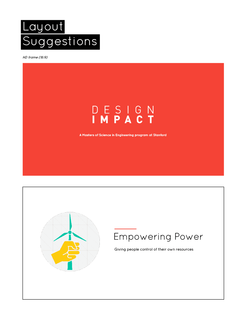
The style guide contains simple example layouts for slide decks and presentations so to encourage the user to follow the established aesthetic.
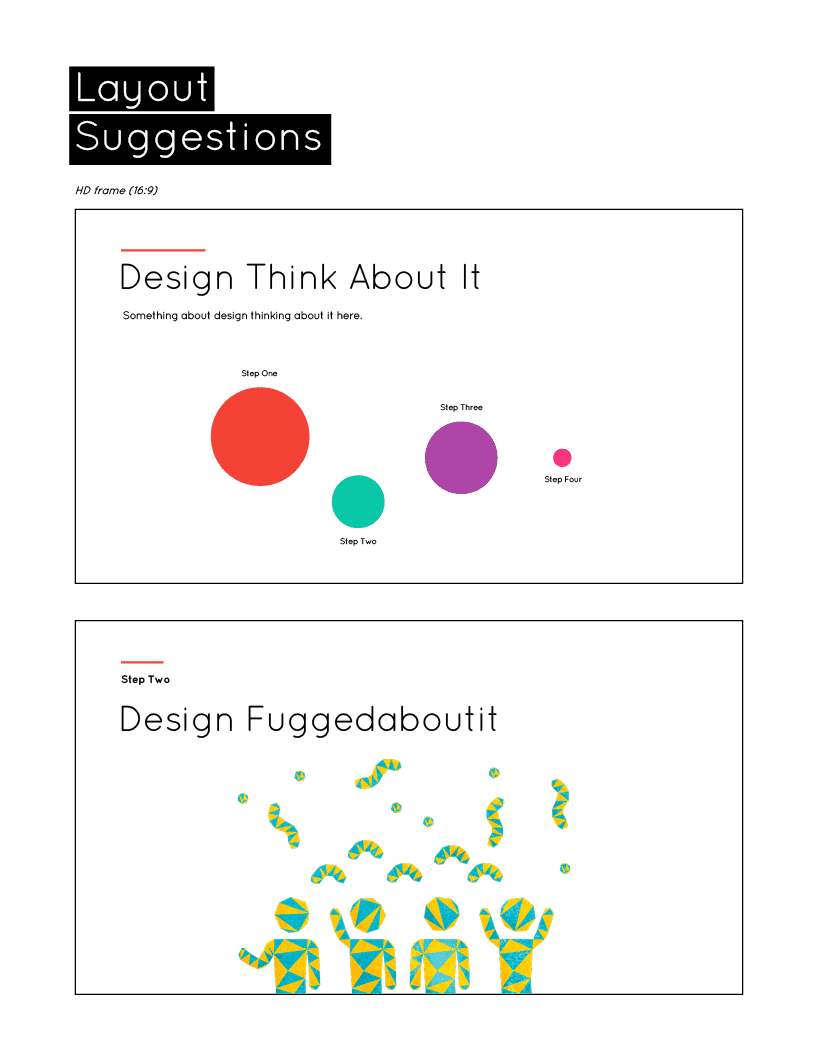
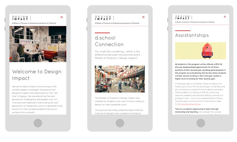
All of these elements were used in the development of the website. The website had to be easily updatable by anyone so the decision was made to build it on Wordpress with a multipurpose theme to accelerate development. Templates and example pages were created that compliments the style guide so that additional pages can be easily created in the future.
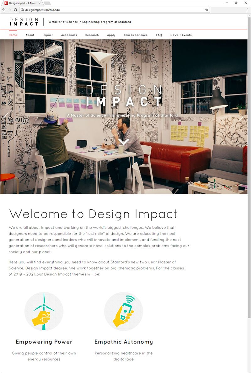
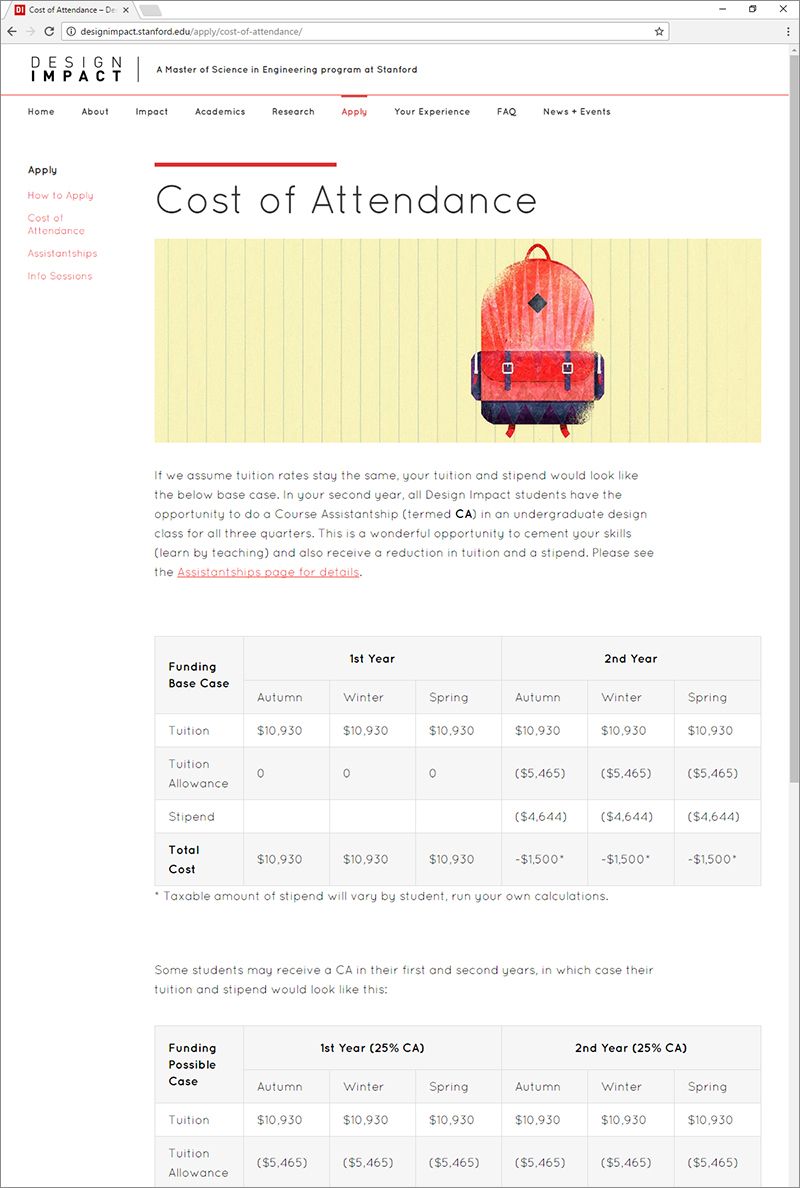
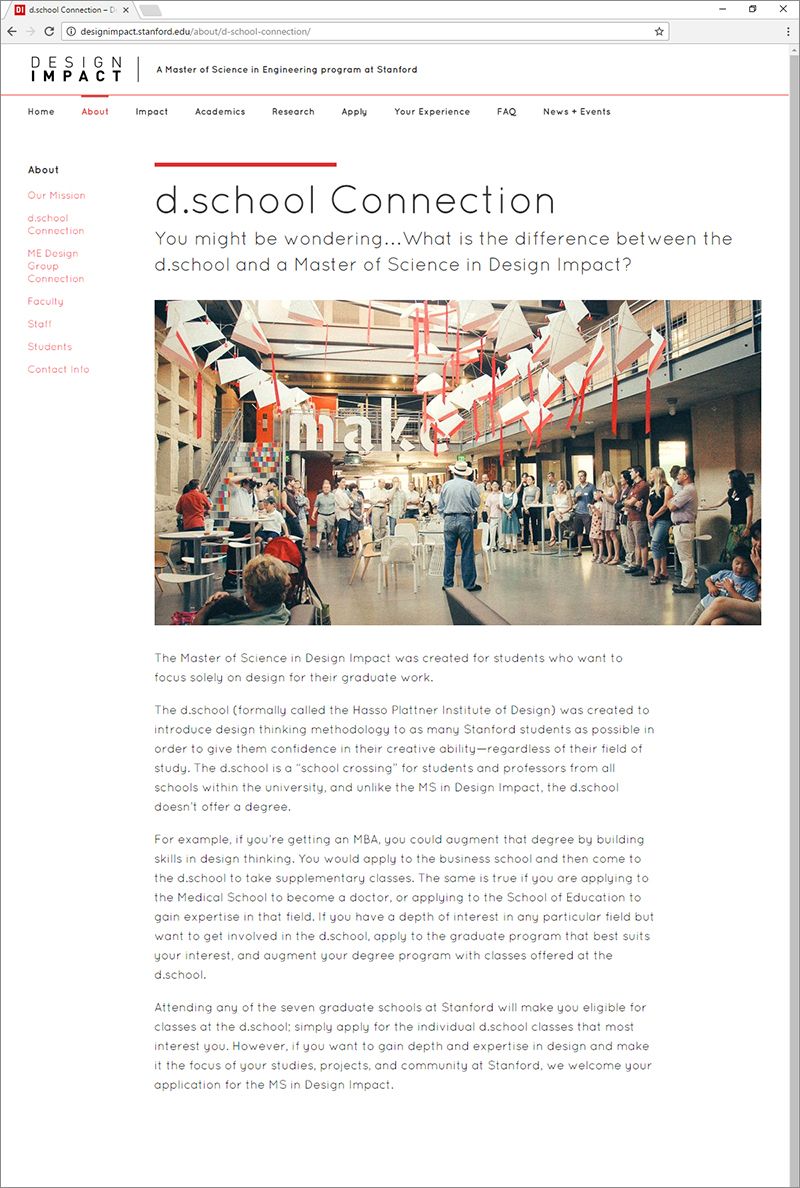
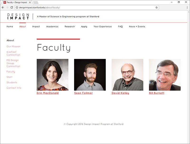
Check it out! Design Impact.
Design Impact brand, visual creative direction, website development: Dickson Chow.
Illustrations: Kanhika Nikam.

